

Apps
Nederland van Boven
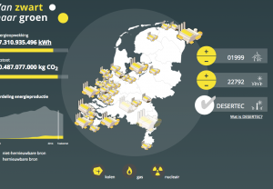
Earlier in 2011, Hack de Overheid collaborated with VPRO to host a event App in a Day which brought together the national geo-information community with web developers. Ten months have passed and the television series has just finished airing, reaching millions of viewers. As expected, the shows is nothing short of spectacular with its high-altitude videography and satellite-view perspectives, which are able to convey the complexity of how a highly industrialized European nation functions on a day-to-day basis. It charts what happens to infrastructure and networks of material flows as they pass across a variety of different themes and scenarios. Some of these include: electricity use, water, farming, property, the skies, underground and safety.
What’s also available aside from the now aged medium of television is a website which is tasked with making sense out of reams of data all expressed through some rather insightful data visualization tools. Jasper Koning, production lead of NL van Boven, VRPO took me through the data visualizations that accompanied the weekly documentary broadcasts. “What’s interesting is how the tools can help you answer questions or give you further insights into what you are looking at”, he says, showing me as he manipulated the sliders maximum and minimum settings and proceeded to drag a slider to the left and right to show me how the data rapidly changes on the map. The site caters to both to the digitally literate and people looking for a quick overview per episode.

The application continues where Mapumental stopped, which if you remember, crossed travel times into London with property prices giving the user an insight on where perhaps bargains might still be had or where living outside the city could be advantageous as travel times would minimize inconveniences.
“We used open-source software, including code authored by Stamen, a Californian based data visualization design agency, to draw the reference cartography and cache the data files. Web maps are made of small, 256 px by 256 px images, stacked next to each other in a grid and displayed in the browser as a slippy map, allowing the user to pan and zoom. The application logic in Flash allows us to speedily update the map (using the GPU) when the data filters are adjusted. Software utilized includes TileStache, Cascadenik, Dymo, ModestMaps, Mapnik,QGIS, OGR, and GDAL. Much of the data provided by VPRO was generated in ArcGIS in-house and in partnership with XYZ. The place search is powered by the Yahoo! geocoder.”
The project is a showcase for how open data and film can work together to inform and entertain, across television and web. I hope it inspires companies and broadcasters to raise to bar in their future productions and to push the uptake in fusing data experts with story tellers.
James Burke
Laatste berichten van James Burke (toon alles)
- Nederland van Boven - 12 februari 2012
- Data Blog: Commercial terrain data set - 1 augustus 2011
- Inzending: Dude! Where’s my car? - 9 mei 2011