
Data
Exploring energy and industry data on enipedia.tudelft.nl
On many levels, accessibility is one of the big challenges in the push for open data. As we know, it’s not just about publishing data in open standards and making it available via APIs, but it’s also about taking it a step further and presenting the data in forms in which people can easily explore and digest. Just as we have supply chains for converting raw materials into finished products, with open data, we’re trying to create these chains of intelligent people who can turn raw data into actionable insight within different knowledge domains.
Our own domain relates to topics of energy and industry, which we study at the Faculty of Technology, Policy and Management at TU Delft. This faculty recognises that some of the biggest problems the world is facing are of such a complexity that they require an interdisciplinary approach. For example, transitioning to a greater reliance on renewable energy requires understanding not just the technologies themselves, but also how policy, economics, and social acceptance can either enable or derail the process. I believe that we’re actually facing two issues here – the complexity of these problems, and also the question of how to organise our brains together to better understand and solve those problems.
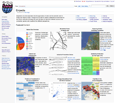
Enipedia.tudelft.nl - an active exploration into the applications of wikis and the semantic web for energy and industry issues.
To help address this, we have set up enipedia.tudelft.nl. This site is a platform where we can explore a variety of different approaches to both organising and communicating complex data. The foundation of the platform is a wiki which allows for community discussion, and also allows the creation of templates which we employ to provide many different human-friendly visualisations and views over data. Behind the scenes, we use Semantic Web technologies to integrate and query data from several different sources.
A key philosophy behind the site is that we expect for there to always be problems with the data, and we try to provide the mechanisms to highlight the issues and fix them. One way that we do this is through the widespread use of visualisations. We have found these to be incredibly efficient at rapidly communicating complex information, and we employ a wide variety such as maps, timelines, bar & pie charts, treemaps, and network diagrams. An important feature is that these visualisations are all automatically generated from the source data, meaning that once you fix the underlying data, you just have to click refresh to get the latest overview.
One of the big projects you can see there relates to power plants, for which we’re recently created a Google Earth KML file that allows you to see the locations, fuel types, and power outputs of over 50,000 power plants around the world. What’s happening here is that we have adopted a large dataset from Carma.org that documents individual electricity generation plants around the world. The people who originally compiled this did great work, although they have since moved on to other projects, and the data is now a few years out of date. To help this, we created a wiki page for every power plant, and have set up forms, so that people can easily update the different data fields for a power plant. Additionally, we have begun linking these power plants to their corresponding entries in other datasets such as eGRID (the US EPA’s Emissions & Generation Resource Integrated Database) and the E-PRTR (the EEA’s European Pollutant Release and Transfer Register). Because of the Semantic Web technologies running behind the scenes, this allows us to compare and integrate the data that we have with the latest datasets compiled by official agencies.
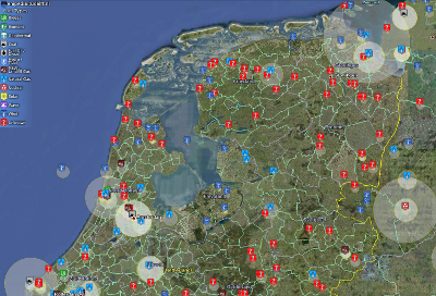
Google Earth visualisation of location, fuel type, and power output for over 50,000 power plants
This is not about having a single view over data, and we recognise the value in exploring the data from multiple scales and perspectives, which is in line with Eric Raymond’s observation that “with many eyes all bugs are shallow“. For example, when you look at the page for a single power plant, there is a link to a page on the owner company, where you can then look at their portfolio. There is also a link to the country, where you can quickly get an overview of the fuel sources used, who has the most market share, and where the largest plants are located. This is all based on individual bits of data that through queries are aggregated and redisplayed dynamically.
Another ongoing project involves the documentation of natural gas production, consumption, and supply networks. Natural gas is the cleanest of the fossil fuels and will likely replace nuclear fuel and coal in transition towards more responsible power generation around the world. Despite that, natural gas resources are located in the areas far away from their destination markets and require significant long term commitments and infrastructure investment.
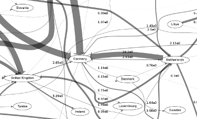
Visualisation of global flows of natural gas between countries, allowing one to easily identify producers and consumers and explore aspects of geopolitics.
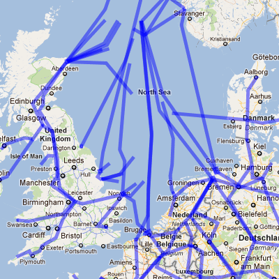
The intricate network of natural gas pipelines feeding Europe from the North Sea
Recent improvements in technologies have enabled the extraction of previously unrecoverable gas from shale deposits, and this has led to drastic changes in the size of natural gas reserves for many countries. Now the future consumers of gas are also the owners of huge shale gas deposits. The balance of power on energy markets is changing, international trade and politics will also be important factors as we assess our cleaner fuel options.
There are many more examples on the site, and at a higher level, this is essentially an exploration of how to improve our relationship with data. It’s important to realise that people need data and data needs people. In other words, people need up-to-date relevant information, while for data to be up-to-date and relevant, it needs enough people going through it, finding problems, and upgrading it. Doing this efficiently requires leveraging and creating feedback loops between the respective strengths of both humans and computers. People are great at pattern matching, and understanding the context behind the data, while computers are great at automating repetitive tasks and highlighting outliers that should be brought to people’s attention. While we have tried to incorporate these ideas on the site, this is still an area where much more research needs to be done.
Our work described here has been inspired by many of the efforts that are under way with open data initiatives. We are encouraged by the creativity and innovation we are seeing, and hope that our own efforts and insights can feed into this and enable us to better meet the challenges that the world is facing.
top image courtesy of Claudio Schwarz under a BY-NC_DI CC license
Thanks to Alfredas Chmieliauskas for contributing to this post.
christopher
Laatste berichten van christopher (toon alles)
- Exploring energy and industry data on enipedia.tudelft.nl - 4 augustus 2011
is it possible to download all the power plant data for a specific country